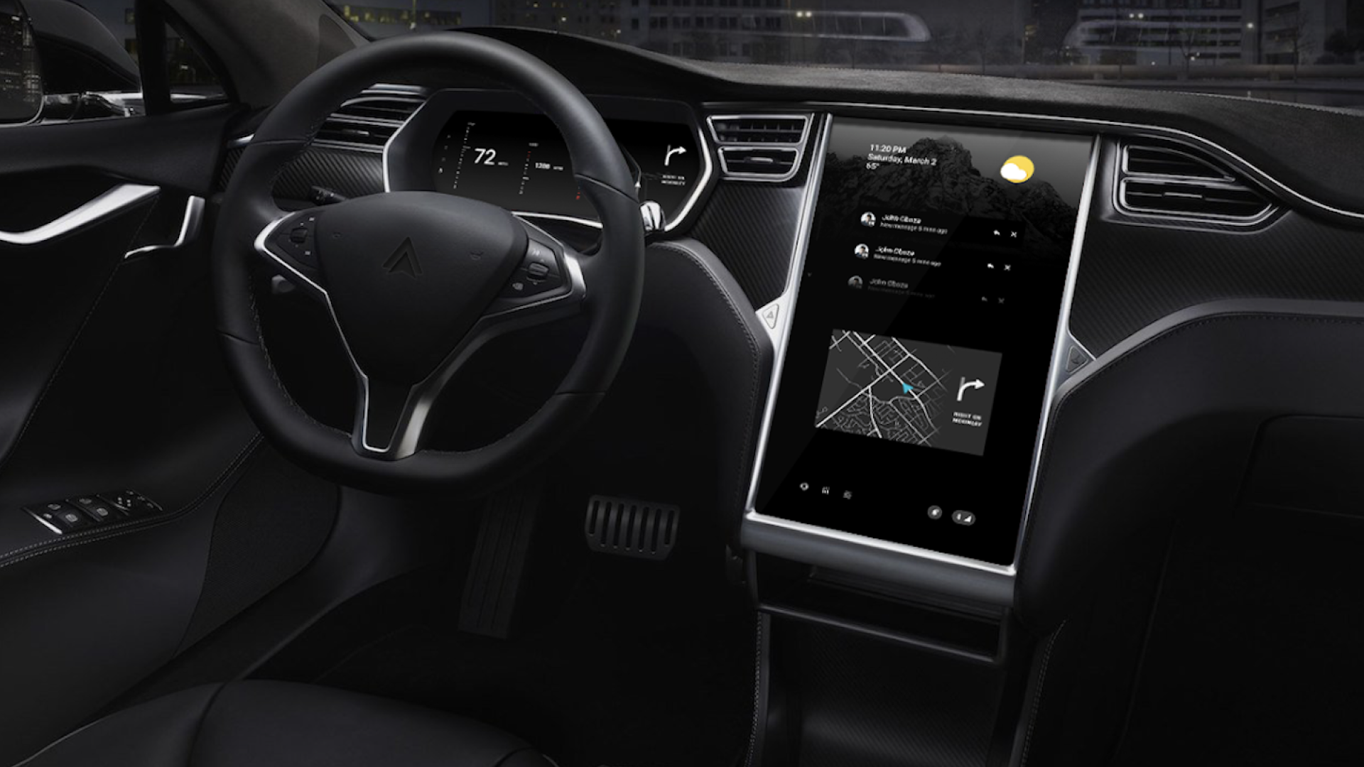
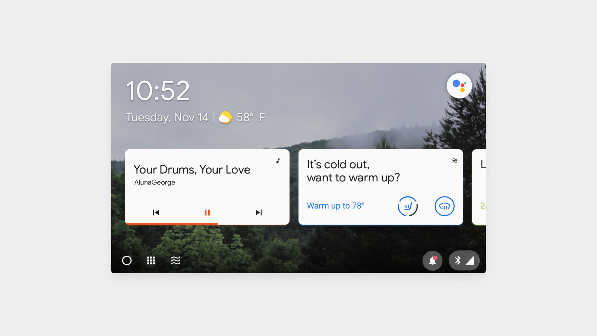
Android Automotive OS
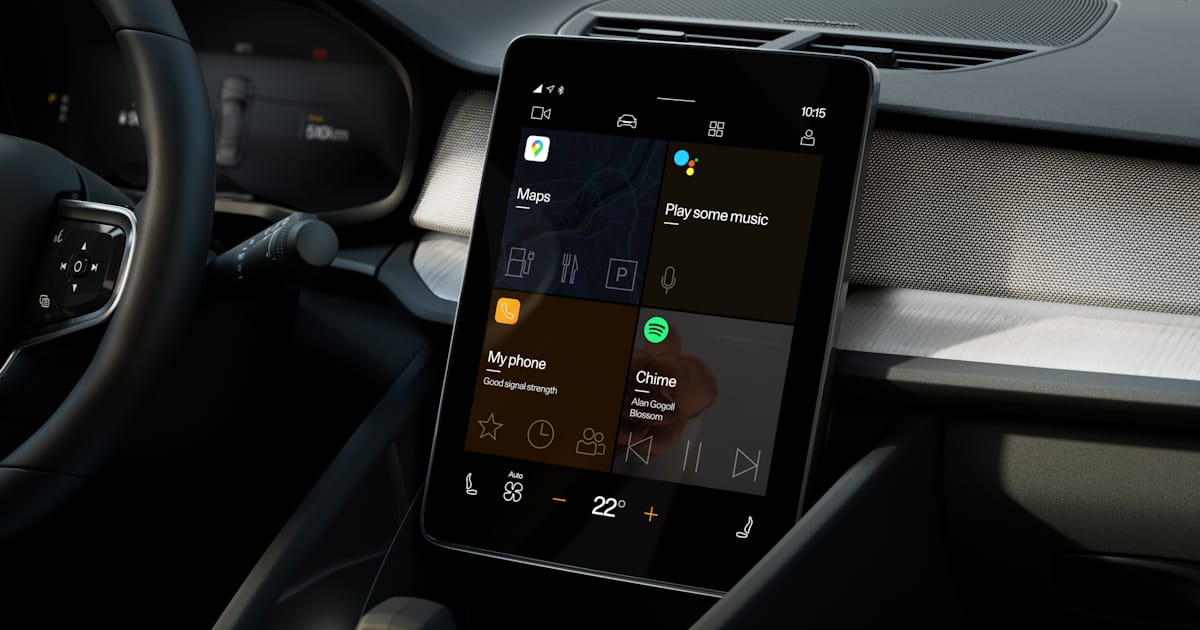
Google’s Android Automotive OS is an open platform for in-vehicle displays. It delivers a standard experience while allowing customization for automotive manufacturers and app developers.
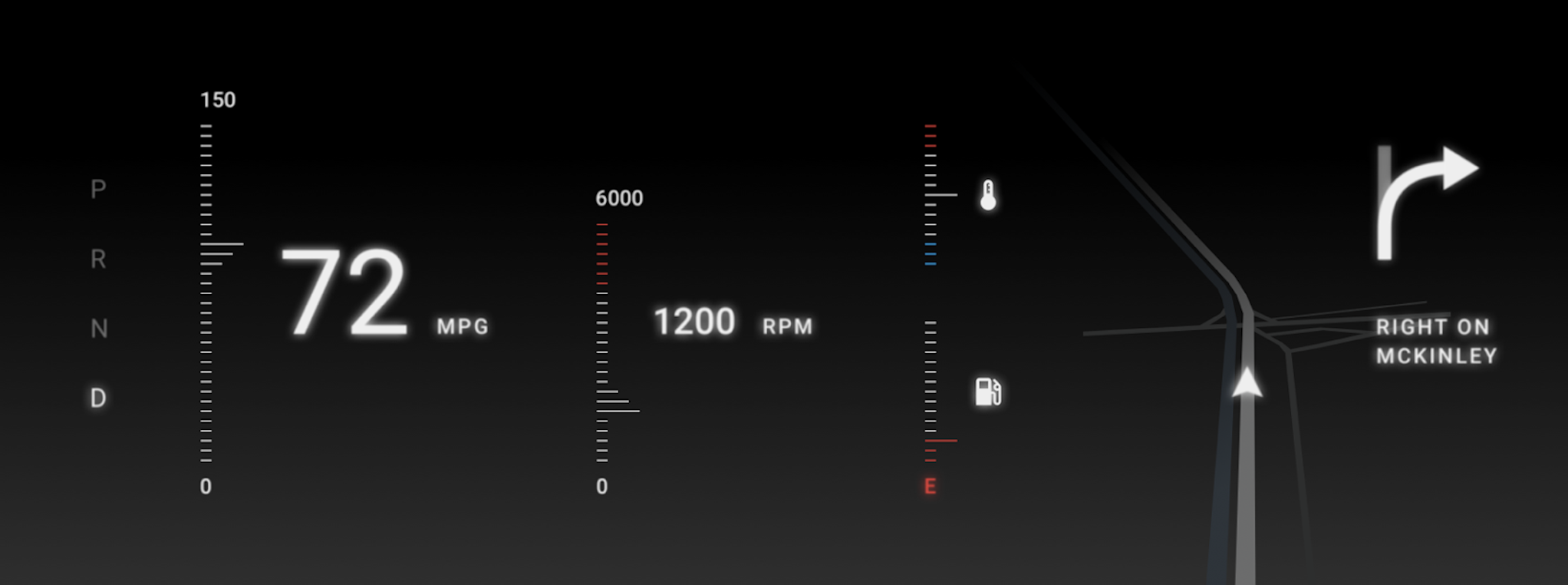
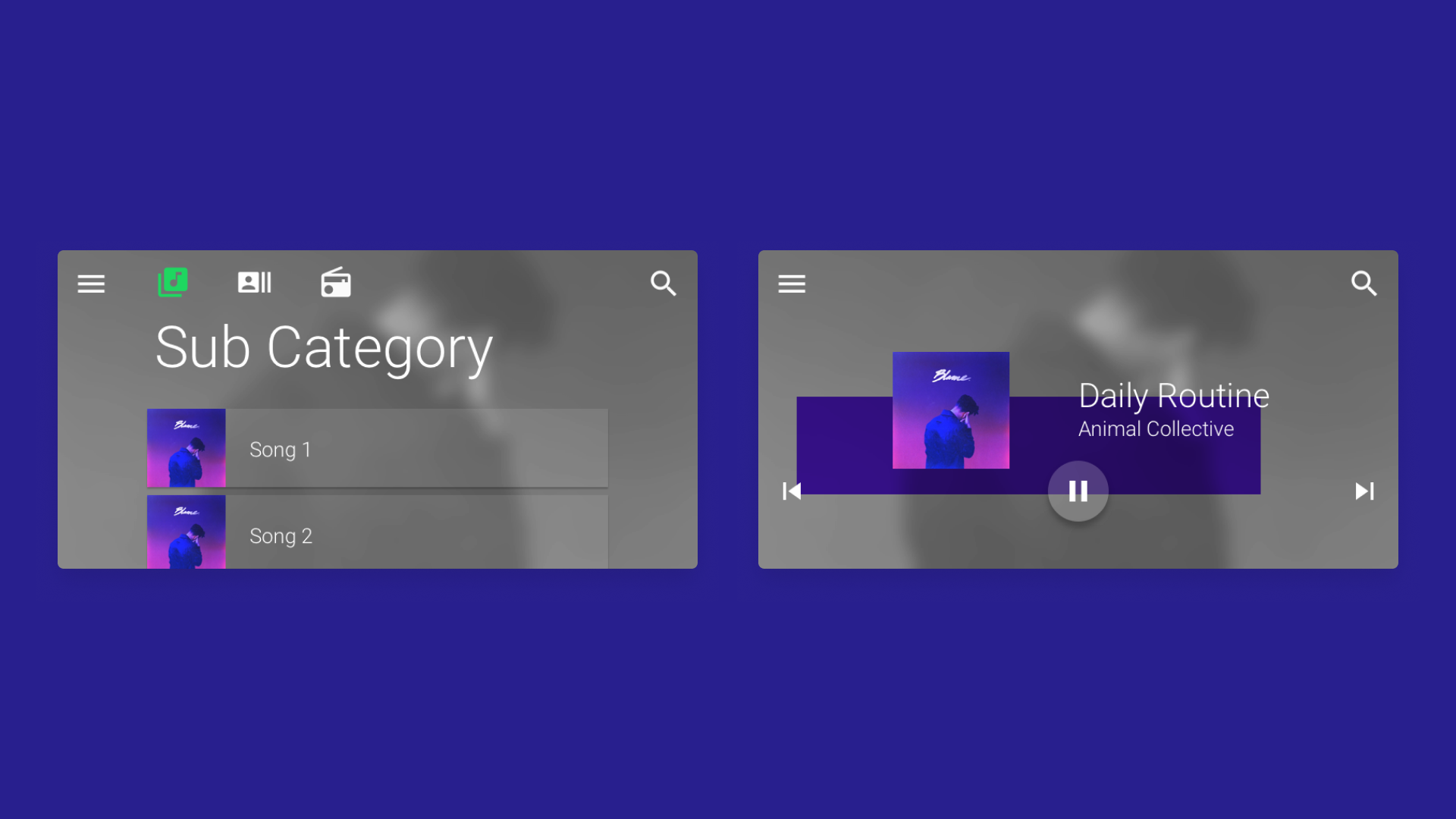
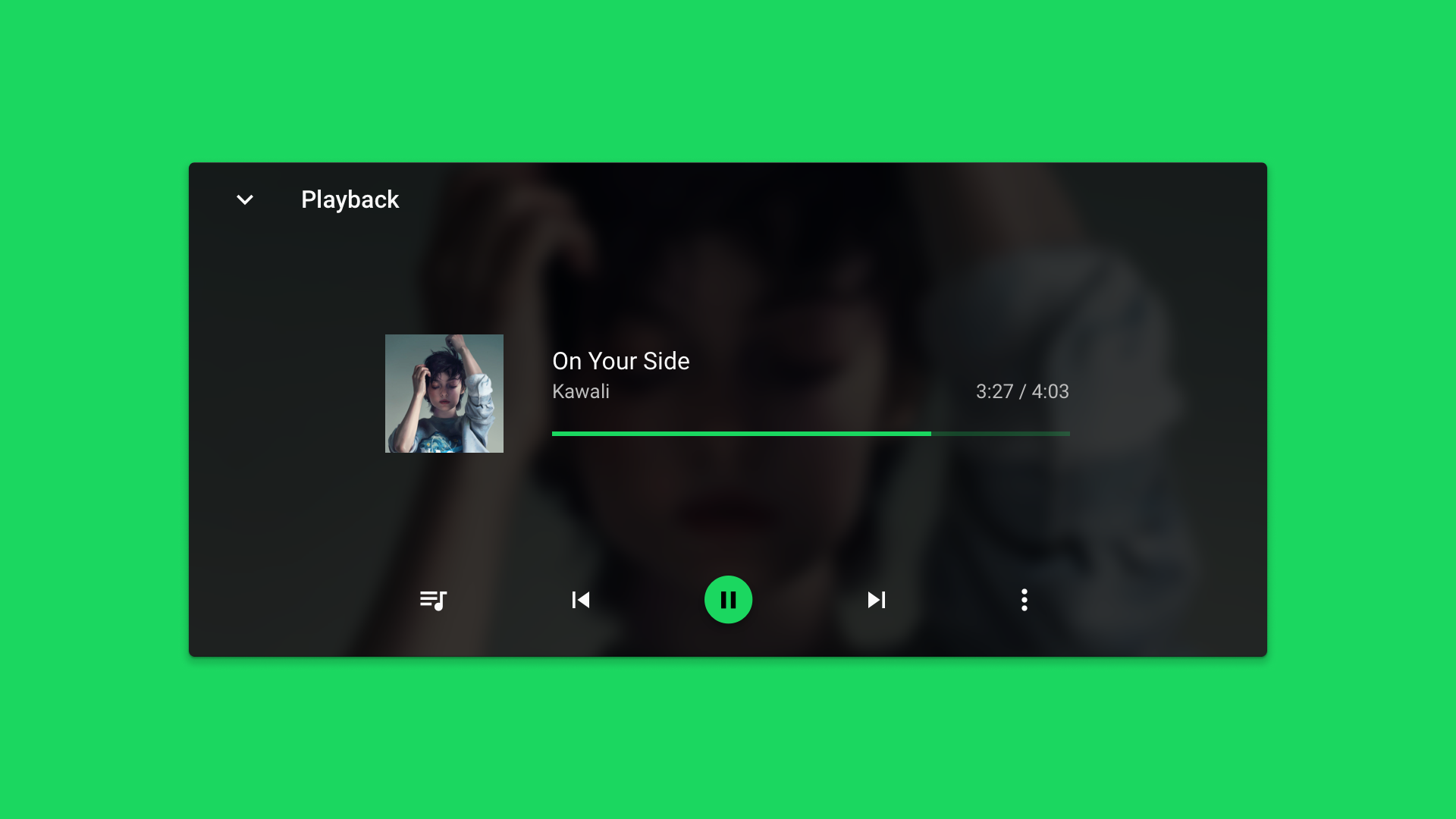
I joined AAOS at its infancy and had the opportunity to kick-off our design system with another designer. This also served as a refence for our code library, requiring deep collaboration with engineers. I also led UI for net-new features such as media player, notifications, quick settings, and widgets. I worked closely with UX researchers to establish foundational best practices for driver interaction behaviors.
After going from 0 to 1, my first demo was in partnership with Ford and our first release-to-market was with Polestar.

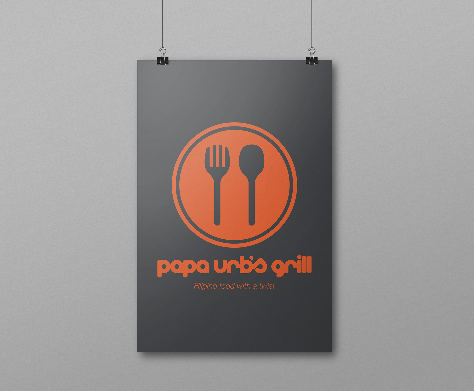
Papa Urb’s Grill
Papa Urb's Grill is a Filipino fusion restaurant located in Stockton and Tracy, CA. The brand identity and business collateral were designed to reflect the modern yet friendly take on Filipino cuisine and culture. Logotype is custom made.


Feel The Beat
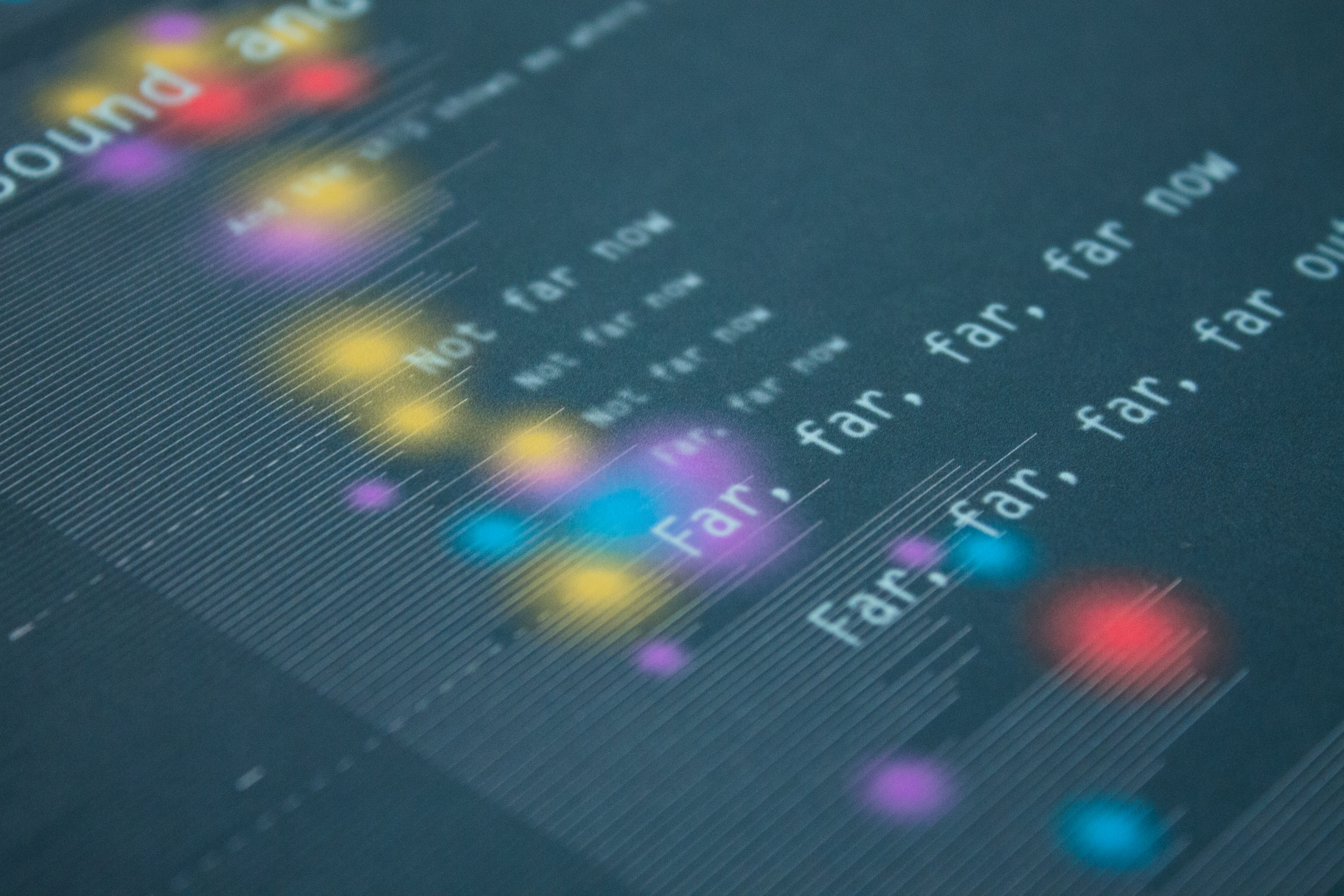
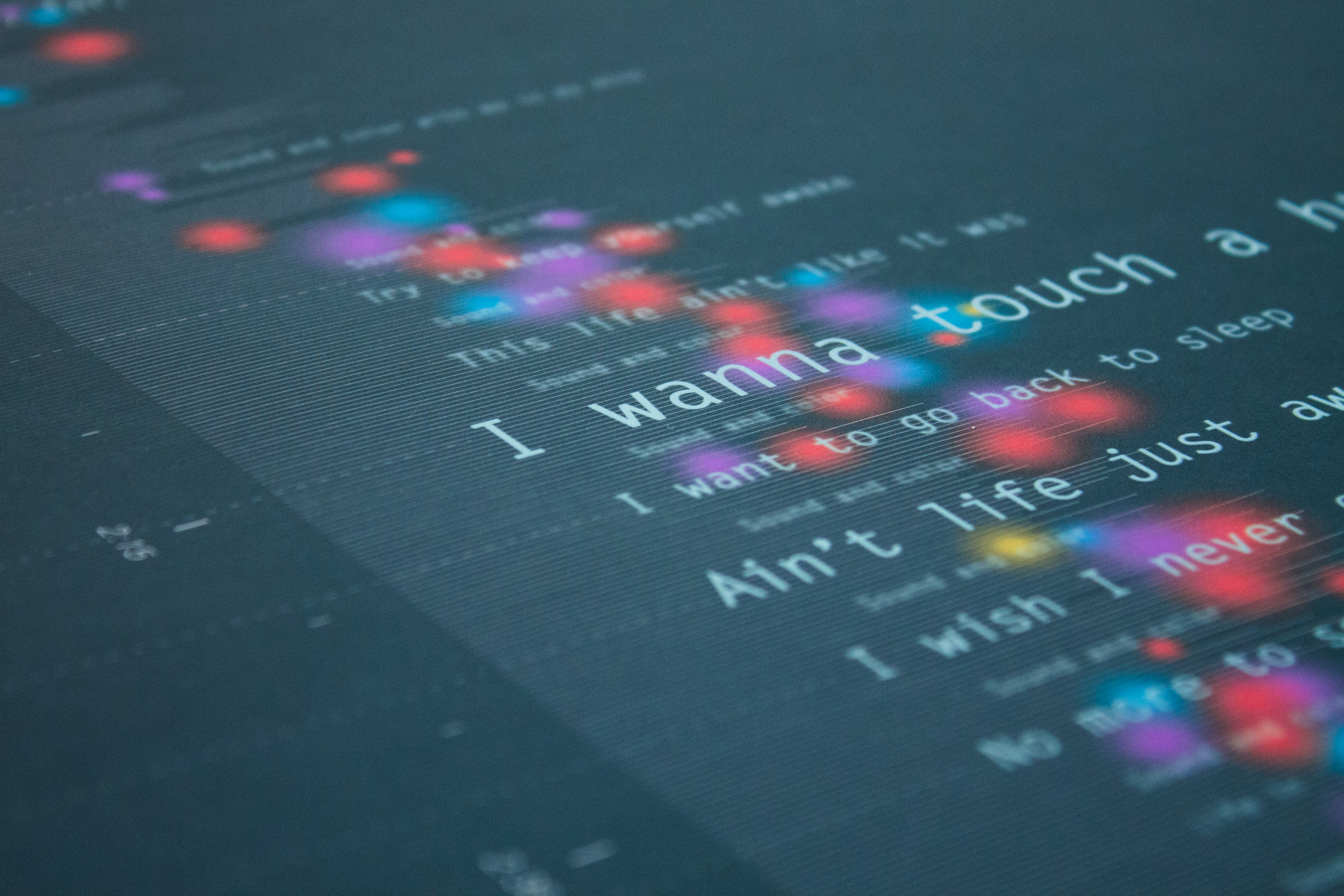
“Feel the Beat” is an infographic that explores the emotional journey one experiences throughout the course of a song. Music is deconstructed to discover what creates a mood and how listeners react on a deep, emotional level—a relationship between musical ambience and human physiology.
A total of 18 people participated in the study. Once these logs were received from every participant, the results were aggregated and translated visually over an audio histogram of the song.
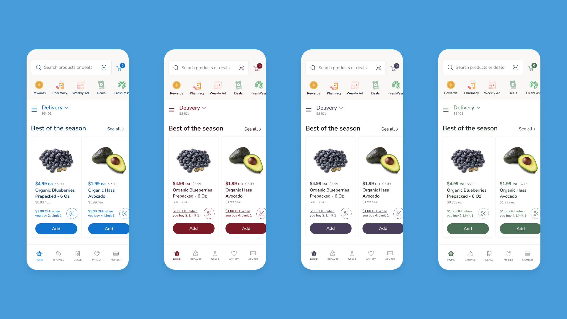
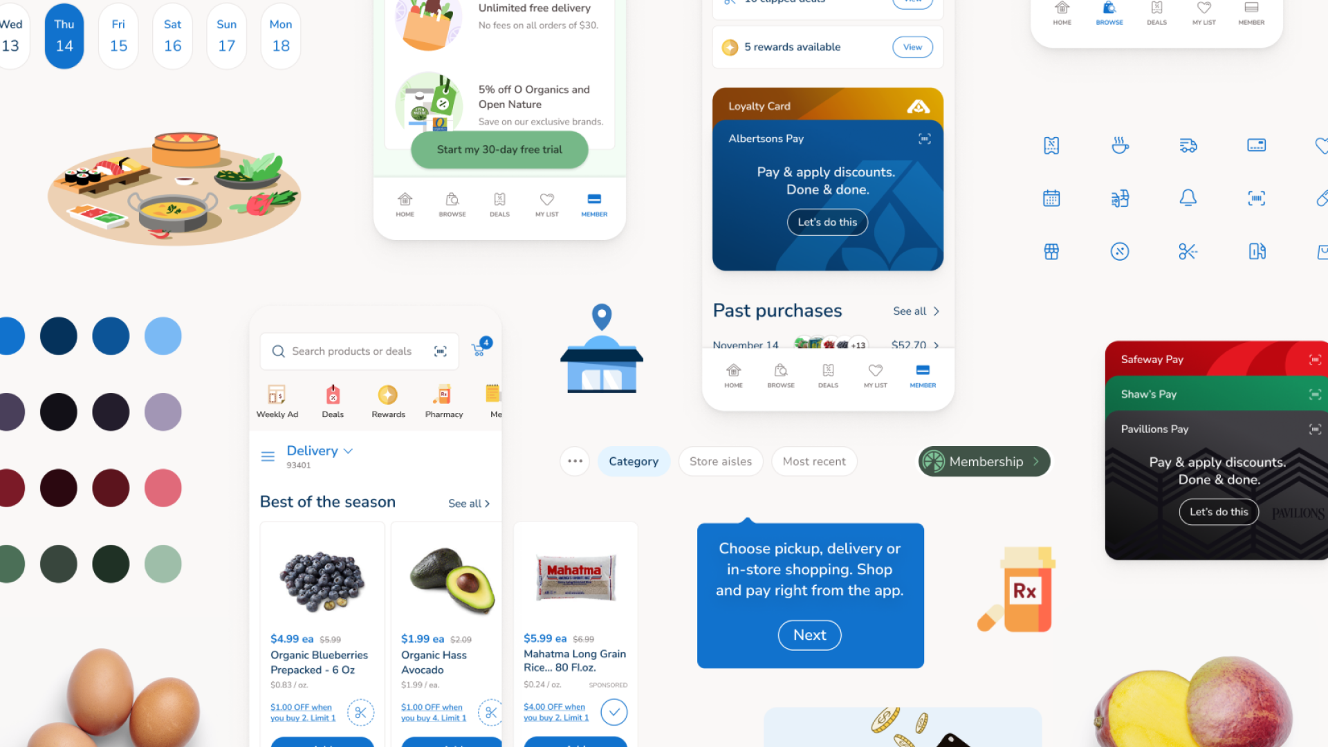
Albertsons
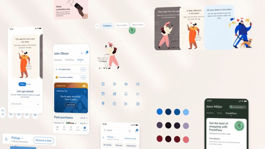
Online grocery shopping drastically increased during the COVID-19 pandemic. This called for an app refresh with more thought put into the shopping and ordering experiences. Until now, the Albertsons apps were outdated and difficult to scale.
We were tasked with a full app redesign for Albertsons and its 17 banners, including Safeway, Vons, and more. In partnership with our Art Director, I co-led a design system that could scale for various store themes and future features that were being explored. Part of this work included an illustration strategy (in partnership with an illustrator) that honored DEI. I also owned UI and led junior designers for experiences such as browsing, lists, deals, and barcode scanning.
As the project wrapped up, I partnered with content and motion designers to put together YML’s project case study.
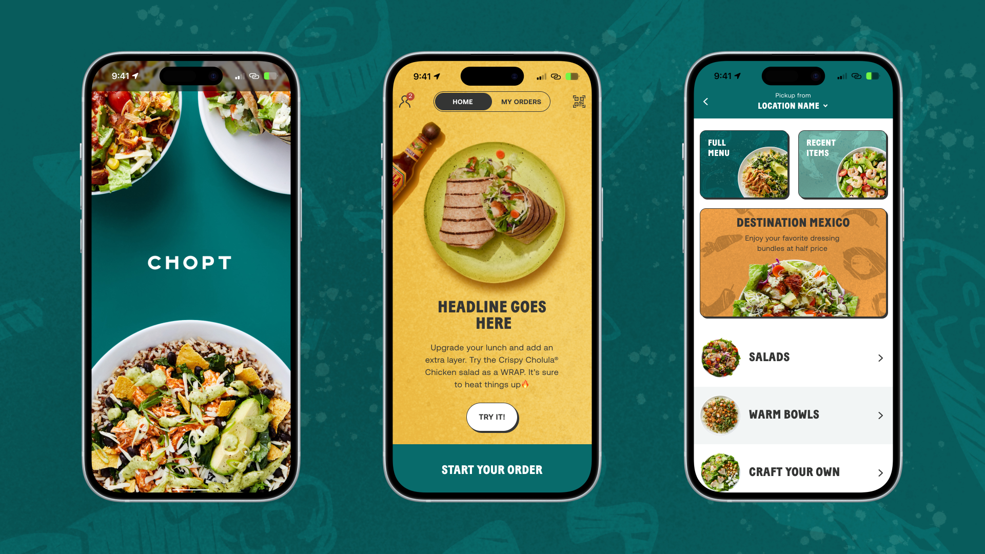
Chopt
The Chopt app was due for a redesign that would streamline navigation and encourage customer loyalty. In order to stand out, we wanted a fresh approach to the UI and an emphasis on the meal customization and reordering experiences.
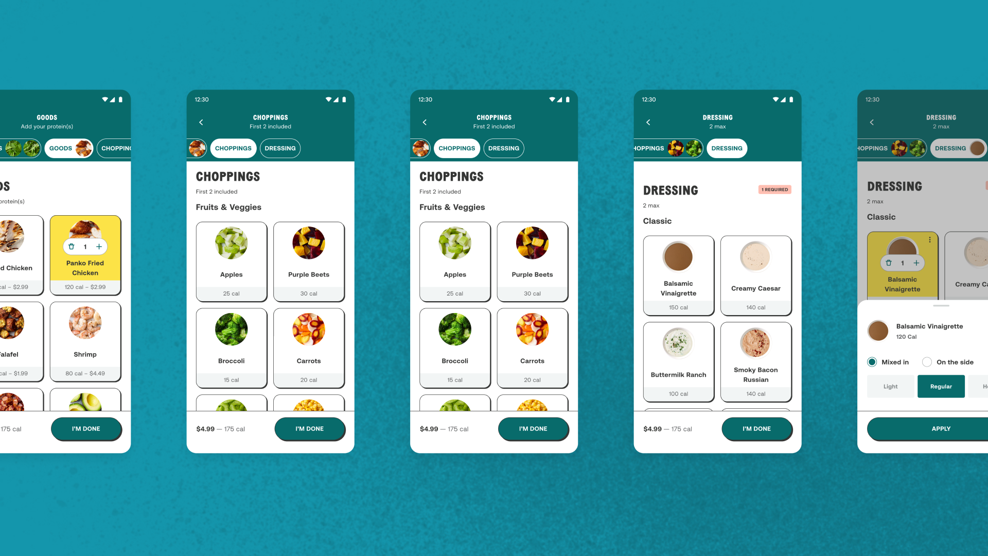
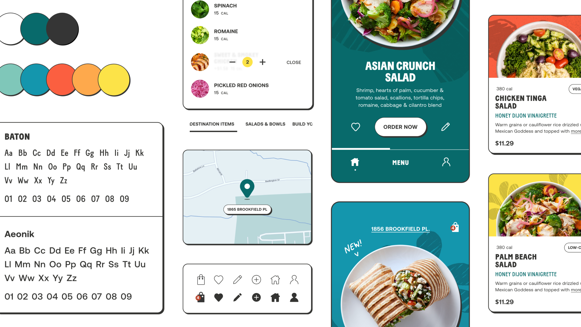
Customization means countless possibilities. As owner of the meal building experience, my goal was to reduce friction and embed moments of delight through intuitive interactions and visuals. I also helped redefine the UX architecture for reordering, identifying mindful moments where reordering components should be surfaced. All work funneled into a design system that was also being built, so every component I introduced or redesigned was meticulously specced.
Customization means countless possibilities. As owner of the meal building experience, my goal was to reduce friction and embed moments of delight through intuitive interactions and visuals. I also helped redefine the UX architecture for reordering, identifying mindful moments where reordering components should be surfaced. All work funneled into a design system that was also being built, so every component I introduced or redesigned was meticulously specced.